Yeh guide kis kaam mein madad karti hai
Bauhaus Restaurant ke current supported sections aur controls use karein. Yeh reference visible controls dikhati hai taake sahi guide mile aur unavailable section na dhoondna pare.
Shuru karne se pehle
Store owner ya Edit design access chahiye. Isi store category mein theme chunein. Theme change se pehle original content sambhalein; catalog/operations Partner mein.
Yeh kahan milega
Workspace → Experiences → store → Visual Editor. Phone par editor menu/rail se named panel kholein. Preview size controls se computer/phone inspect karein.
Qadam ba qadam
-
Theme mein category ke offered themes se Bauhaus Restaurant select karein.
-
Brand & colors check; theme starting colors fill kar sakta hai. Intended changes dein.
-
Neeche editor panels kholein. Customer capabilities storefront features hain, separate editor panel nahin. Ek field badal kar preview inspect karein.
-
Items/stock/prices/collections/options ke liye Partner management link aur catalog guide follow karein.
-
Phone par panel menu kholein, computer side rail na dhoondein. Long panel ke andar scroll karein.
-
Preview ke baad Save. Save manual hai; publish aur checkout eligibility alag.
-
Public store dobara khol kar phone/computer layout, links, checkout aur order page check.
Choices ko samjhein
-
Theme — Layout chunein; theme badalne par visible sections badal sakte hain.
-
Brand & colors — Naam, branding aur supported header info dein. Phone aur computer previews dono check karein.
-
Experience name (Brand & colors): Zaroori field. Displayed wording likhein.
-
Primary color (Brand & colors): Optional field. Brand color chunein aur text contrast check.
-
Accent color (Brand & colors): Optional field. Brand color chunein aur text contrast check.
-
Modes offered / Default mode (Brand & colors): Light, Dark ya dono chunein; dono hon to default chunein. Dono par visitor toggle milta hai.
-
Logo image (Brand & colors): Optional field. Supported file upload ya Paste URL karein, fixed 1:1 crop mein logo position karke Use crop aur phir Save changes chunein. Allowed formats: PNG, JPEG, WEBP.
-
Logo icon (Brand & colors): Optional field. Displayed icon/preset chunein.
-
Menu items — Catalog Partner mein manage hota hai. Visual editor read-only view aur management link deta hai.
-
Pricing — Current stores ke visual editor mein currency/pricing read-only preview hai. Product prices, charges, promotions aur delivery fees ke liye Manage in Krobr Partner use karein.
-
Buttons — Visible button words badlein; unavailable action ka wada na karein.
-
Submit button text (Buttons): Zaroori field. Displayed wording likhein.
-
Add button text (Buttons): Optional field. Displayed wording likhein.
-
Primary button label (Buttons): Optional field. Displayed wording likhein.
-
Fulfillment — Actual checkout methods Partner mein configure; presentation field unavailable method activate nahin karta.
-
Submission page — Customer order-page presentation customize; status/payment rules operational settings hain.
-
Re-order (Submission page): Optional field. Dikhane/enable ke liye on; chhupane/disable ke liye off.
-
Request change / cancel (Submission page): Optional field. Dikhane/enable ke liye on; chhupane/disable ke liye off.
-
Contact business (Submission page): Optional field. Dikhane/enable ke liye on; chhupane/disable ke liye off.
-
Leave a review (Submission page): Optional field. Dikhane/enable ke liye on; chhupane/disable ke liye off.
-
Opening hours — Hours dikhana presentation hai. Actual opening times, all-Closed aur timezone Partner mein control hain.
-
Map / Location — Correct location/address dein aur displayed map/directions test karein.
-
Embed code (paste from Google Maps) (Map / Location): Optional field. Readable text aur line breaks check karein.
-
Heading (optional) (Map / Location): Optional field. Displayed wording likhein. Zyada se zyada 60.
-
Address (optional) (Map / Location): Optional field. Displayed wording likhein. Zyada se zyada 200.
-
Hero — Main headline, supporting text aur allowed cover controls se store introduce karein.
-
Show this section (Hero): Optional field. Dikhane/enable ke liye on; chhupane/disable ke liye off.
-
Dashed slogan tag (Hero): Optional field. Displayed wording likhein.
-
Headline (Hero): Optional field. Displayed wording likhein.
-
Subheadline (Hero): Optional field. Readable text aur line breaks check karein.
-
Show rating (Hero): Optional field. Dikhane/enable ke liye on; chhupane/disable ke liye off.
-
Primary button label (Hero): Optional field. Displayed wording likhein.
-
Story — Business clear text mein batayein aur long paragraphs phone par check karein.
-
Show this section (Story): Optional field. Dikhane/enable ke liye on; chhupane/disable ke liye off.
-
Title (Story): Optional field. Displayed wording likhein.
-
Body (Story): Optional field. Readable text aur line breaks check karein.
-
Featured — Supported featured presentation aur referenced available items check karein.
-
Show this section (Featured): Optional field. Dikhane/enable ke liye on; chhupane/disable ke liye off.
-
Visit — Visit se pehle needed store info dein; operational hours/contact se match karein.
-
Show this section (Visit): Optional field. Dikhane/enable ke liye on; chhupane/disable ke liye off.
-
Address (Visit): Optional field. Displayed wording likhein.
-
Google Maps link (Visit): Optional field. Displayed wording likhein.
-
Contact — Correct contact ya contact form text dein. Message order nahin banata.
-
Show this section (Contact): Optional field. Dikhane/enable ke liye on; chhupane/disable ke liye off.
-
Eyebrow (Contact): Optional field. Displayed wording likhein.
-
Title (Contact): Optional field. Displayed wording likhein.
-
Body (Contact): Optional field. Readable text aur line breaks check karein.
-
Collect: name (Contact): Optional field. Dikhane/enable ke liye on; chhupane/disable ke liye off.
-
Collect: email (Contact): Optional field. Dikhane/enable ke liye on; chhupane/disable ke liye off.
-
Collect: phone (Contact): Optional field. Dikhane/enable ke liye on; chhupane/disable ke liye off.
-
Reviews — Supported review presentation chunein. Asal reviews Partner mein manage hote hain.
-
Show this section (Reviews): Optional field. Dikhane/enable ke liye on; chhupane/disable ke liye off.
-
Show average + count (Reviews): Optional field. Dikhane/enable ke liye on; chhupane/disable ke liye off.
-
Show individual reviews (Reviews): Optional field. Dikhane/enable ke liye on; chhupane/disable ke liye off.
-
Customer ratings — Yeh customer capability prerequisites aur store settings allow hon to available hai. Related task guide follow karein.
-
Customer accounts — Yeh customer capability prerequisites aur store settings allow hon to available hai. Related task guide follow karein.
-
Order confirmation & status — Yeh customer capability prerequisites aur store settings allow hon to available hai. Related task guide follow karein.
-
Visitor light/dark toggle — Yeh customer capability prerequisites aur store settings allow hon to available hai. Related task guide follow karein.
Nateeja check karein
Saved Bauhaus Restaurant storefront supported sections aur intended presentation dikhaye. Is reference mein absent section theme offer nahin karta; zaroorat par doosra supported design chunein.
Agar masla ho
-
Panel missing: selected theme/category aur list check; har theme har section support nahin karta.
-
Catalog read-only: Partner kholein. Section hide se items delete ya store close nahin hota.
-
Theme change par preview farq: colors, supported sections aur phone layout Save se pehle review.
-
Changes gayab: editor chhorne se pehle Save success; permissions/validation check.
Screen ki misaalein
In screenshots mein example data hai. Aap ke naam, amounts aur controls alag ho sakte hain. Apni screen ki current values ko follow karein.
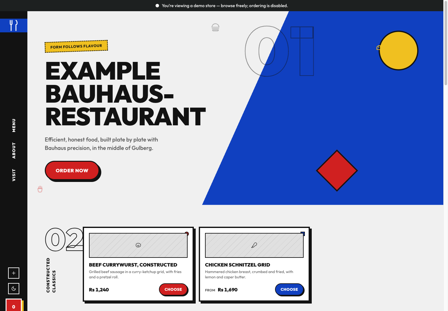
Bauhaus Restaurant theme: controls aur farq: example storefront mein is theme ki layout aur navigation dekhein.